EDF energy glow
The Glow app redesign for EDF Energy was all about making energy usage more transparent and manageable for customers. By focusing on user research and real-world feedback, we created a sleek, intuitive interface that empowered users to track their energy consumption, set goals, and reduce their carbon footprint. The redesign not only enhanced the app’s usability but also aligned with EDF’s mission to drive sustainable energy practices, making energy management easier and more engaging for everyday users.

Senior UX Designer
Apr 2019- Oct 2019
Revitalising an old supplier with a new way of approaching energy
EDF Energy, as an old player in the energy supply market, is well established in its ways and practices.
RAP (Residential Accelerator Program) was established as an in-house disruptor team meant to work independently, sheltered from all the bulky old business and its inertia, to discover new ways of working and positioning in the market.
My colleagues and I worked through extensive discovery phases to tease out exactly what the customers think and feel, and how they relate to their energy provider.


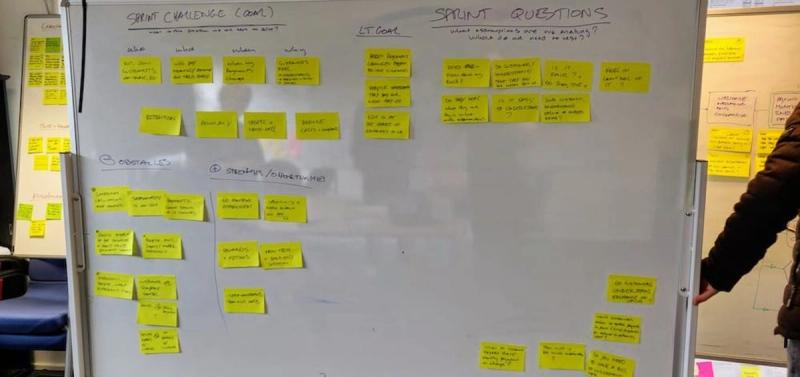

Through workshops and collaborative sessions, we got a good picture all that happens both in the several layers within the company and from the customer’s point of view.
Taking a scientific approach
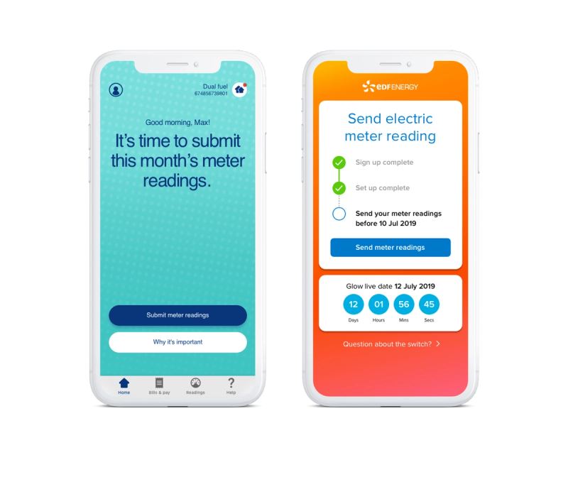
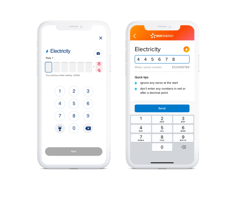
We then came up with hypotheses of what we thought would be true, such as “Customers don’t provide meter reads because they are hard to do” or “Customers prefer to have their app secured with a fingerprint”.
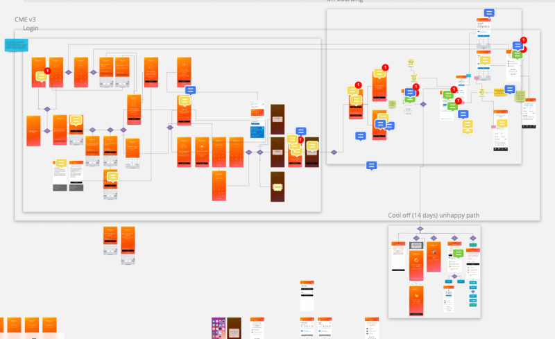
Then we planned a test through a discussion guide, making sure to be as unbiased as possible, and trying to put the participants in the situations we wanted to study and observing their behaviour, rather than asking them outright. Once we had that, we prepared whatever materials we’d need to run the sessions. This usually consisted of just a prototype of the app, but occasionally it would be necessary to draw up some emails or mockup some price comparison websites.
The findings were then collated and processed into a report, to weed out any bias the researcher might have themselves (like overvaluing the findings from one very loud participant which would not be statistically significant).
Finally, we took the findings and altered the design to match what we found. Occasionally, if the findings weren’t clear enough, or there were still multiple solutions that fit the findings, we’d run 2 or 3 rounds of testing, to get to a level of certainty we’d be comfortable with.
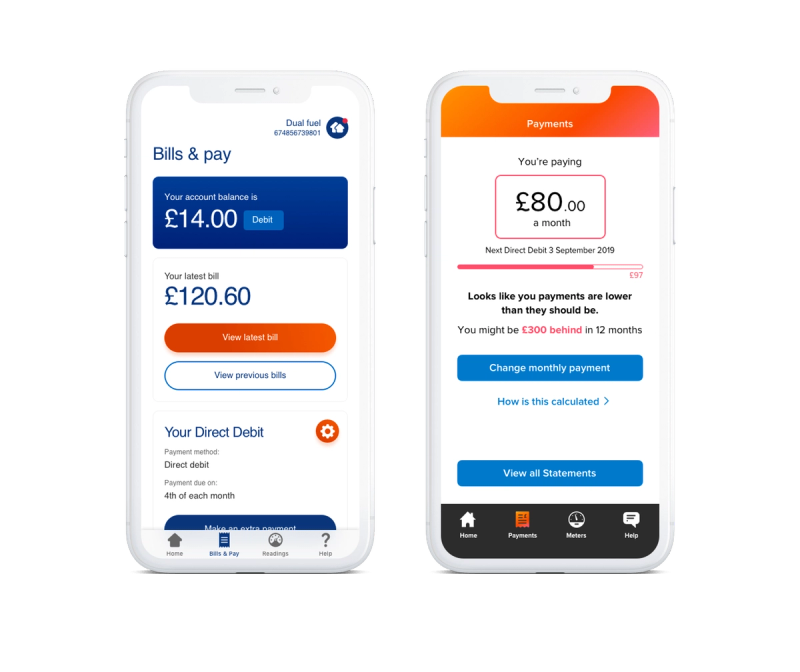
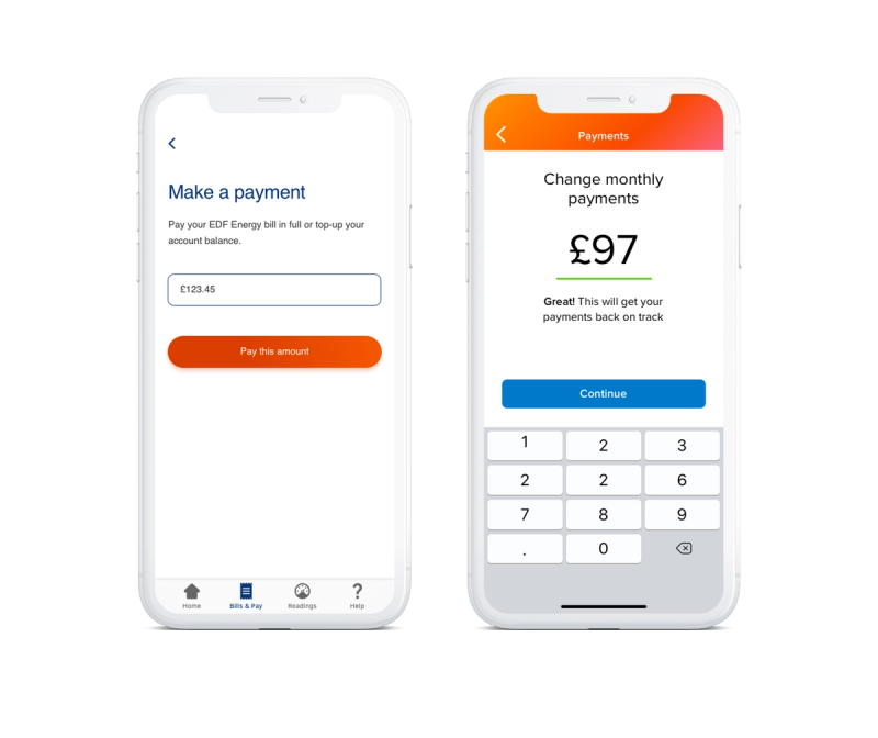
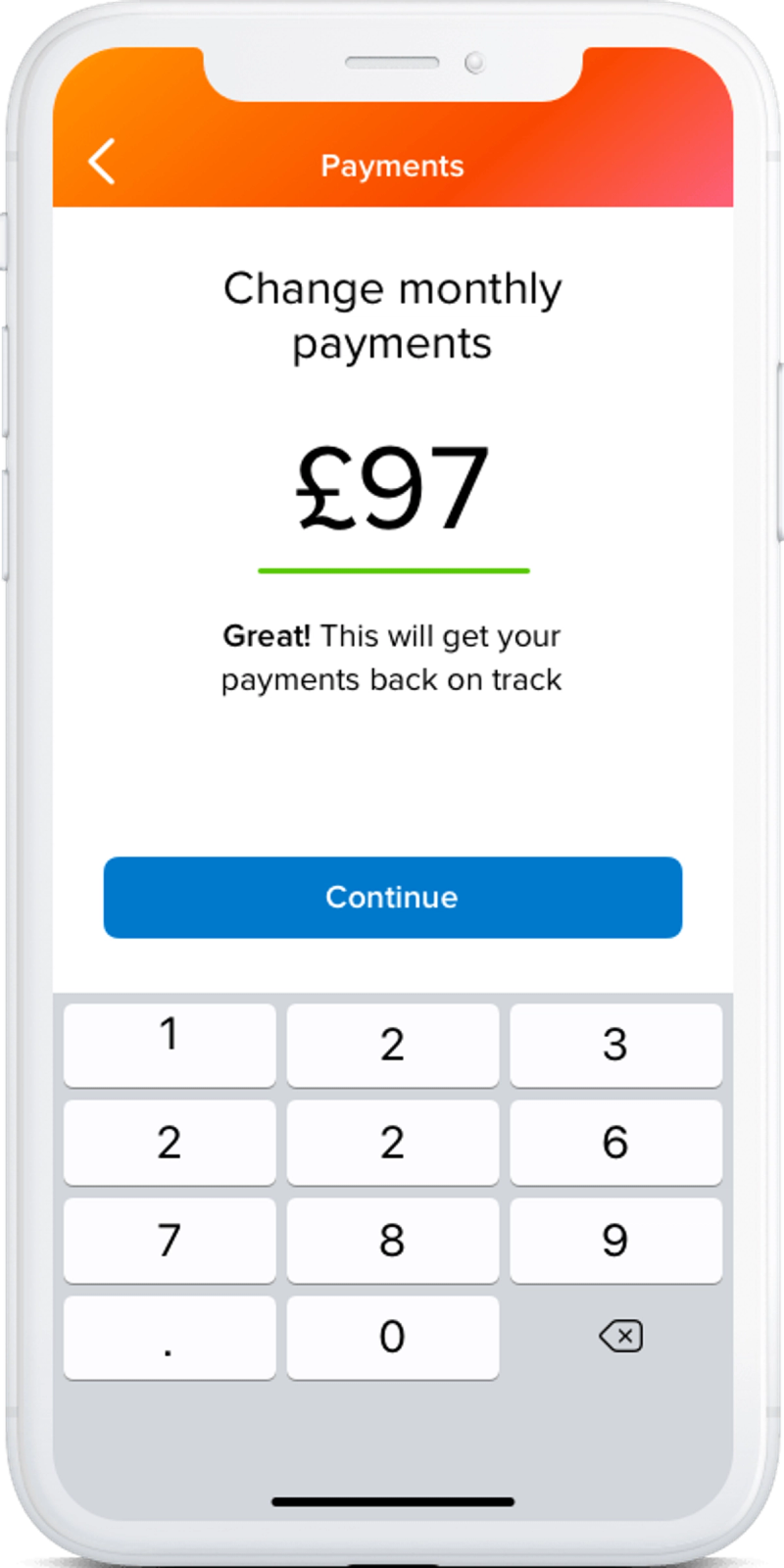
This allowed us to come up with a simplified and streamlined experience, that focused on customer needs rather than business or regulatory needs.
As an example, we focused on whether the payments were on track with our projections or needed to be adjusted, as opposed to showing a balance and expecting the customer to figure it out themselves. In fact, it turned out whenever they saw a positive balance they wanted to reduce their payments or take the money out, which would be bad for them since it’s meant to be positive to offset the cost of energy in winter.
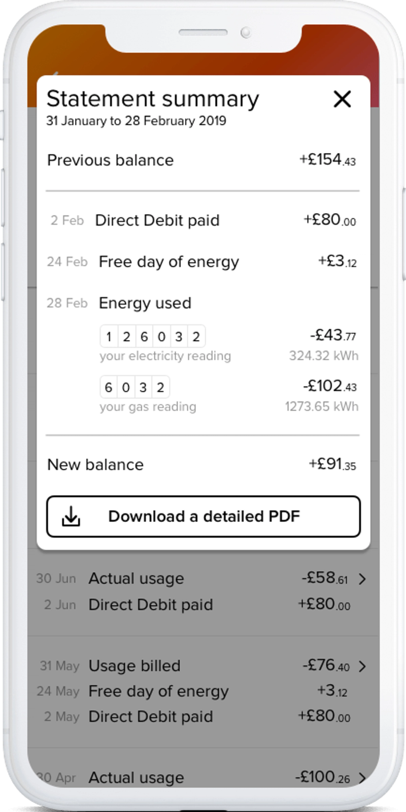
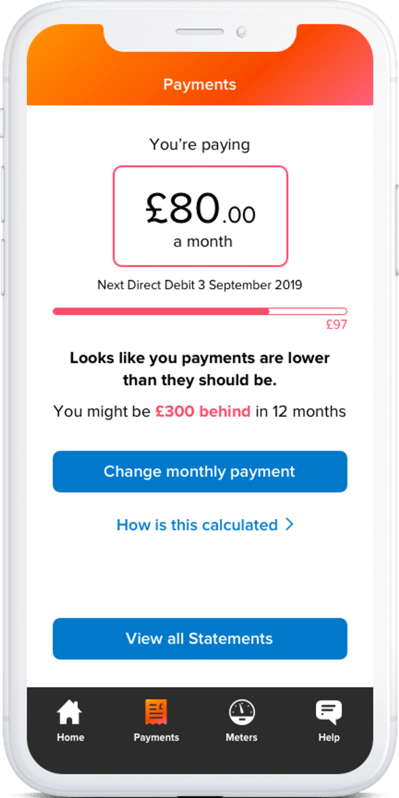
Though it was not a direct redesign, you can see below the difference from the app made by the old business, versus the one we produced.