Enterprise Architecture desktop 2015
The Enterprise Architecture Desktop 2015 project focused on simplifying and improving the user experience for architects working with complex system diagrams and data. By understanding the users’ needs and pain points, we designed an interface that made it easier to visualize and manage intricate architectures. The updated design provided a more intuitive and efficient way to interact with the system, helping architects focus on creating better solutions rather than struggling with complex tools. This project highlighted the importance of user-centered design in complex enterprise environments.

Senior UX/UI Designer and Frontend Developer
Feb 2014- Jul 2016
Project Overview
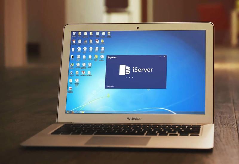
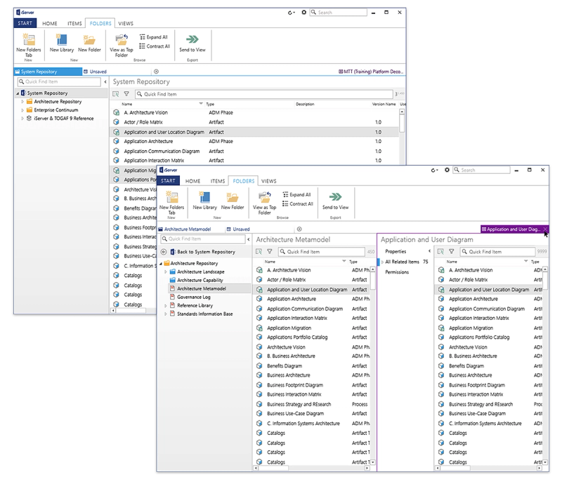
The goal of this project was to enhance the functionality of an enterprise architecture desktop application, enabling architects to add intelligence and organization to the process diagrams they create in Microsoft Visio. By connecting their diagrams to a robust data repository in iServer, users could build more data-rich and organized diagrams, making the application an invaluable tool in strategic decision-making processes.
My Role & Contributions
As the lead Product Designer on this project, I took charge of the entire user experience (UX) and visual design (UI) process from ideation through to implementation. In close collaboration with front-end developers, I was also involved in the front-end development process, ensuring that our design vision translated seamlessly into the final product.
Research and Planning
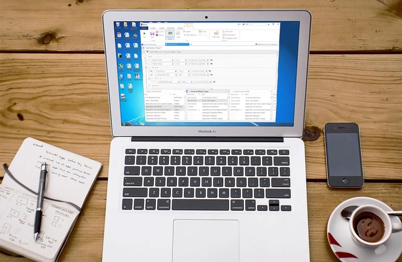
The first step involved a thorough analysis of user needs and their current workflows within Visio. Since iServer integrates with the Microsoft Office suite, particularly Visio, the goal was to create an interface that was familiar to users of Office applications, reducing the learning curve and enhancing usability. We chose to follow Office 2013’s design language and interaction style, aiming to align our product with the broader Microsoft ecosystem.
This strategic choice came with two major benefits:
- Familiarity: Users accustomed to Office apps could adapt quickly, reducing onboarding time and effort.
- Seamless Workflow: Users could switch between iServer and Visio without having to adjust to a different interaction model, maintaining productivity and ease.
Design Challenges & Solutions
The project’s main design challenge was adapting Microsoft’s design language to iServer’s specific needs, which required creating new components that could harmonize with the familiar Office-based interface. Here’s how I tackled each aspect of the design:
- UI Alignment with Office Aesthetics: I carefully examined Microsoft’s UI patterns, selecting components and visual styles that aligned with the Office 2013 interface while being effective for the complex functionality of iServer.
- Custom Components for Enhanced Usability: As the data sets and tasks in iServer were far more complex than typical Office applications, I designed custom components to meet specific user needs, such as detailed data views, advanced filters, and interactive diagrams.
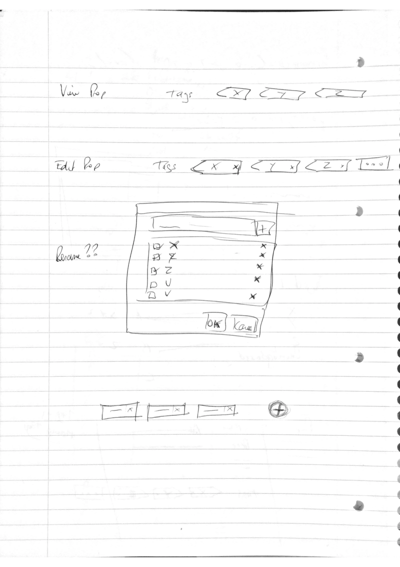
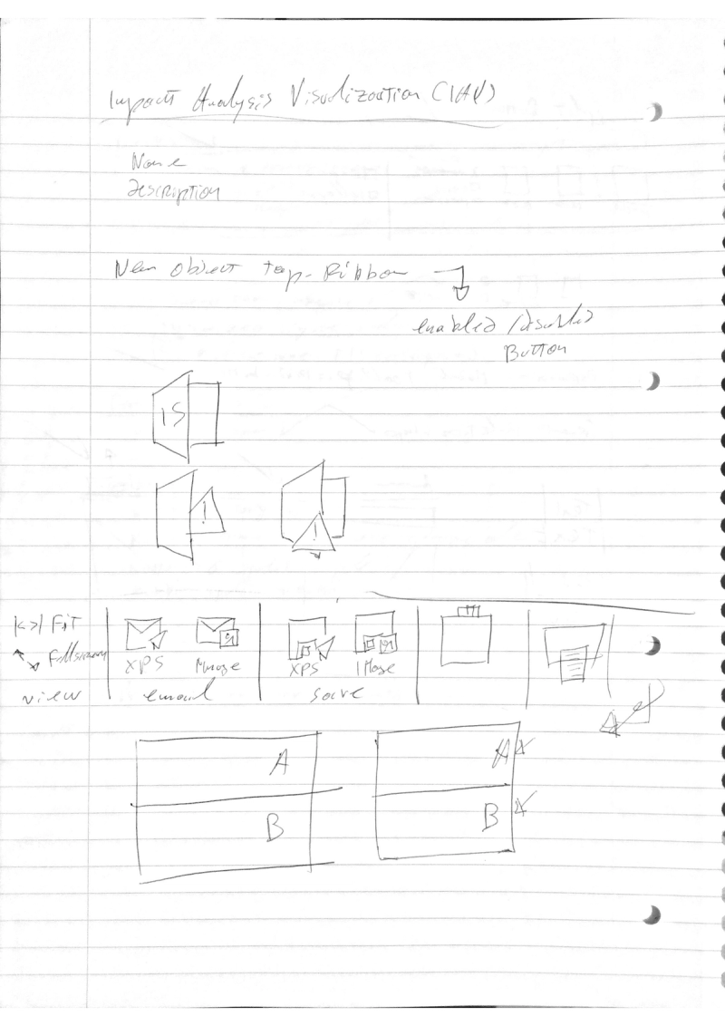
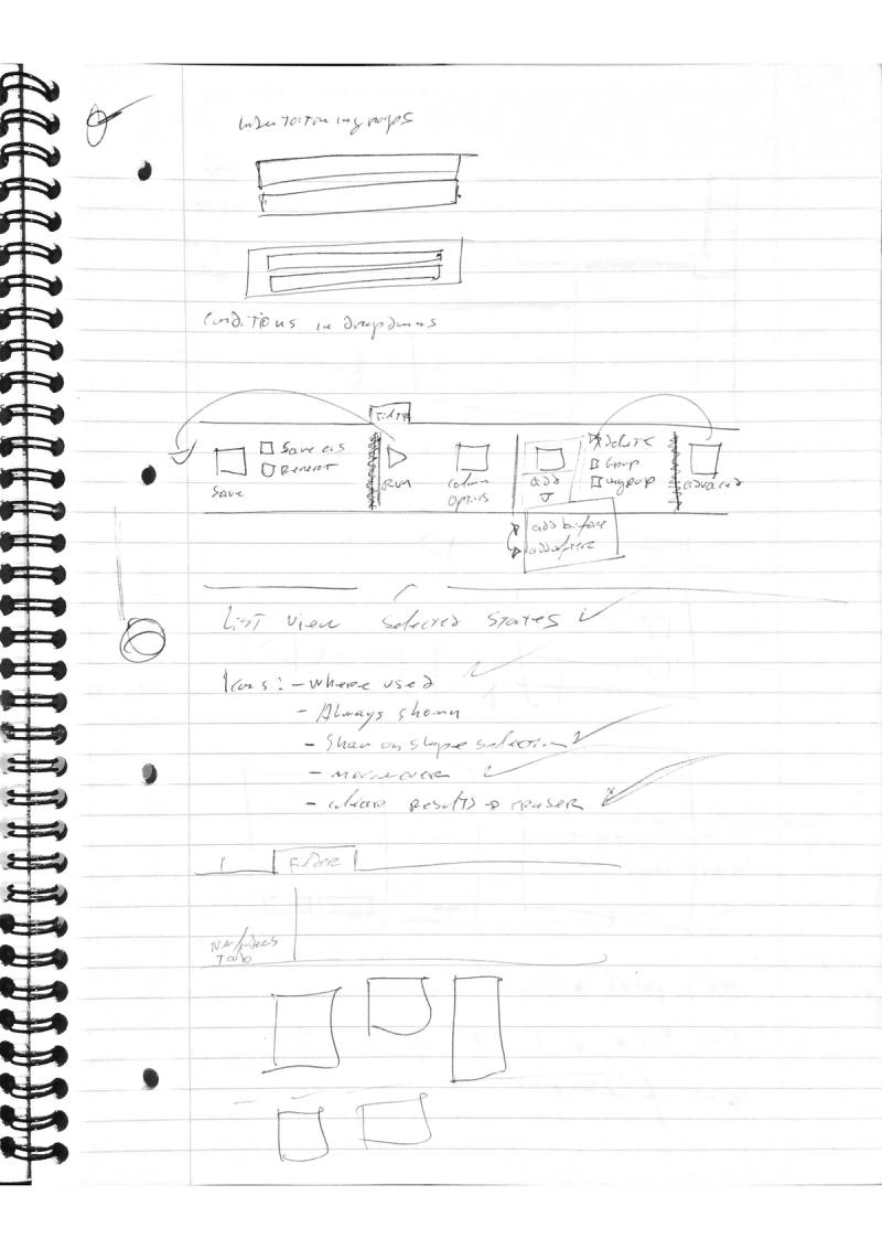
- High-Fidelity Prototypes and User Testing: I built interactive prototypes that allowed users to experience new features and workflows before development. These prototypes were invaluable in gathering feedback, allowing me to make iterative improvements based on real user insights.
Key Features & Innovations
Some of the key features I designed and implemented in the iServer desktop app included:
- Contextual Information Panels: I designed a contextual panel that users could open to view detailed information about a selected object without needing to navigate away from their current view. This approach streamlined the workflow, keeping users focused on their tasks while providing the necessary data at a glance.
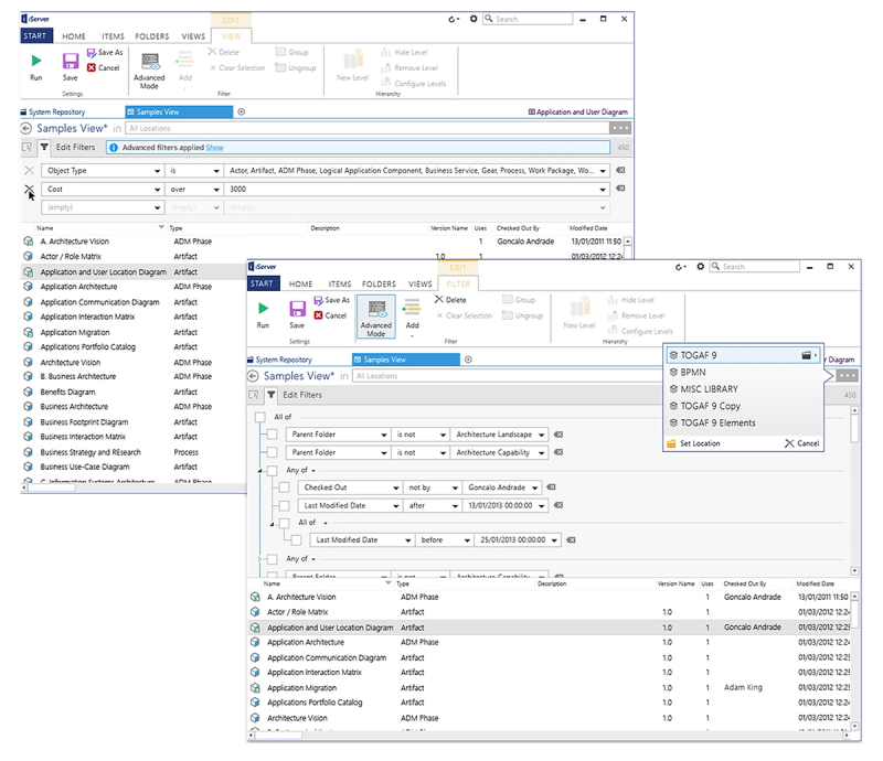
- Advanced Query Builder: To enable users to construct complex filters within their data, I designed an intuitive query builder. Users could specify detailed criteria to quickly narrow down large data sets, which was crucial in an enterprise context where data-driven insights are key.
- Responsive Navigation for Large Data Sets: Given the vast amount of data in typical enterprise architecture projects, I created an intuitive, hierarchical navigation system that made it easy for users to locate and organize data efficiently.
Design Process and Iteration
The design process involved several rounds of feedback and iteration. Initially, I collaborated with stakeholders to define the core user journeys and identify potential pain points. As part of our iterative design approach, I conducted usability tests with real users after each major prototype update. Each round of feedback helped us refine the UI and UX to better serve the actual needs of enterprise architects.
Final Product and Results
The final product was met with enthusiastic feedback from both users and stakeholders. The transition to the new iServer desktop app was smooth, with users appreciating the streamlined experience and the enhanced functionality. The familiar Office-style interface reduced training requirements, and the custom components empowered users to accomplish complex tasks efficiently within the app.
The project not only improved the user experience but also demonstrated the value of aligning a product’s design language with tools users already know well.