Aviva.co.uk Investments redesign
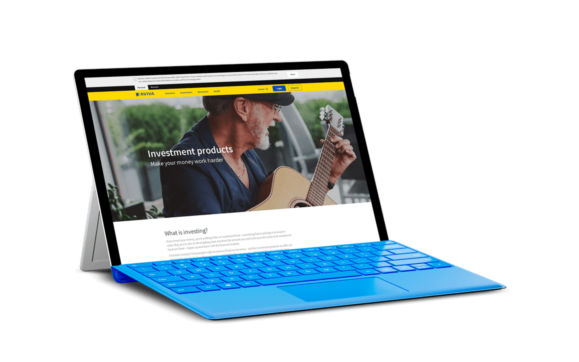
This redesign of the Investments section on Aviva.co.uk aimed to simplify complex financial information and make investment options more accessible to a broader audience. Through user research and testing, we identified key pain points and opportunities to improve clarity and usability. By creating clear, engaging designs and prioritizing user needs, we turned a complex process into a more intuitive experience. The result was a more user-friendly interface that empowered customers to make informed decisions about their investments while supporting Aviva’s business goals.

Senior UX designer
Nov 2017- Aug 2018
I had the chance to redesign the investments section of the UK website for Aviva. The previous one was confusing to the users and not structured consistently, with plenty of duplicated content and jargon.
The products themselves are quite complicated, so they needed to be explained in as simple terms as possible to people who are very distrusting of financial institutions.
What I did
As the sole UX designer assigned to the project, I was responsible for the whole user experience. With the help of my wonderful colleagues, we were able to craft a simpler and friendlier experience.
Discovery
This phase took a long time as we mapped the user journeys and mental models. We conducted a few workshops with stakeholders and SMEs to understand both the users and the products themselves.
After some long talks and an impressive amount of post-its, we managed to understand the products and agree on the journeys the users were meant to go on to apply for them. We managed to reduce the complexity we needed to deal with by a lot.
Funnily enough, it took us a long while before we realised we were assuming people knew all about that ISAs are and what the tax allowance means. I talk about this in more detail in an article I wrote.

Putting ideas to paper
With all this data I then started drafting the wireframes. I needed to also make sure it would look and feel consistent with the other pages that were being migrated onto the same platform.
These other pages, however, were for insurance products, so they naturally had different needs to serve, making them different, but still within the same branded Aviva experience.
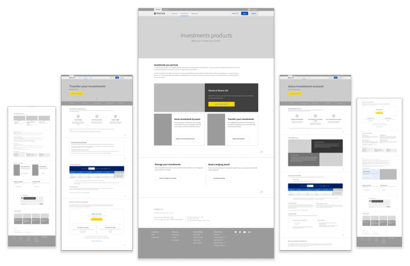
We included some extra features to help the users with the parts they had the most difficulty with, such as a video explaining the product, a calculator to illustrate the fees which were hard to understand and a structured educational content section where the users could go and learn about investments.
In the lab we saw people use the anchor links at the top to read some of that information straight away, and then be confused because the CTA was above.
This was fixed by bringing the bits people were interested in further up.
Small Print
During the usability testing for this, we discovered that participants wanted to read some of the "small print".which had been tucked away to the bottom of the page, under the assumption it wouldn't be as interesting. Turns out people's mistrust of financial institutions runs deeper than we thought
Final delivery
In the end, we had to make some concessions and deliver an MVP to go live, but thanks to all the work put in by everyone it still ended up much better than the previous one.
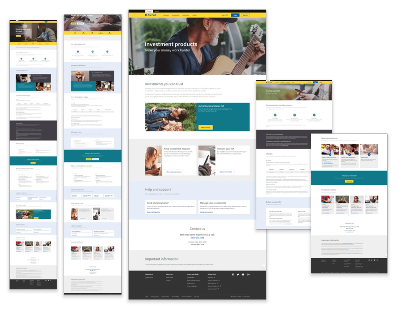
Once the Visual Designer tidied up and put the finishing touches in, we were ready to go live.