
Retirement Aviva.co.uk redesign
The redesign of the Retirement section on Aviva.co.uk aimed to demystify retirement planning and make it more approachable for users. By conducting in-depth user research, we identified key challenges and opportunities to simplify complex financial information. The updated design focused on clarity, accessibility, and providing practical tools to help users plan for their future with confidence. This project successfully delivered a more intuitive and user-friendly experience while aligning with Aviva’s mission to support customers in making informed financial decisions.

Senior Ux Designer
Feb 2017- Nov 2017
I had the chance to redesign the pensions and retirement section of the UK website for Aviva. The previous one was confusing to the users and not structured consistently, with plenty of duplicated content and jargon. This old site was structured from the business point of view, listing out the products like a menu. Problem is, most people have no idea what pension they have or how to use it.
The products themselves are quite complicated, so they needed to be explained in as simple terms as possible to people who are very distrusting of financial institutions.
What I did
As the lead UX designer assigned to the project, I was responsible for the user experience. I worked together with Jahnavee who had extensive knowledge on how to get money out of a pension. With the help of our wonderful colleagues, we were able to craft a simpler and friendlier experience.
Discovery
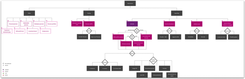
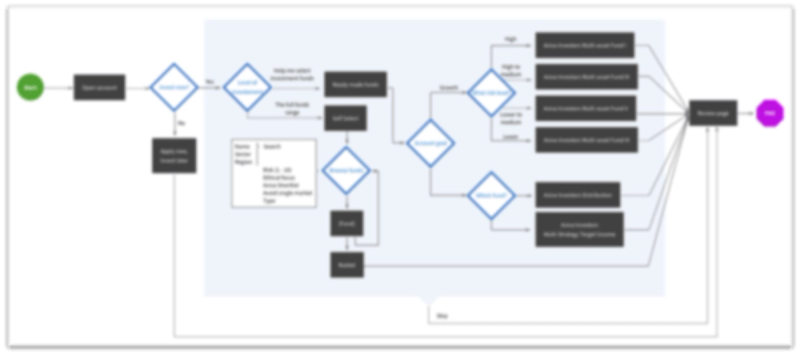
This phase took a long time as we mapped the user journeys and mental models. We also found the sheer number of products and how they related to one another to be quite confusing. In fact, we seemed to get some conflicting information from the business experts themselves. So I Drew up a product map so we could all agree on the same thing using it as a discussion piece.
Involving stakeholders
Workshops with stakeholders and SMEs were conducted to understand both the users and the products themselves.
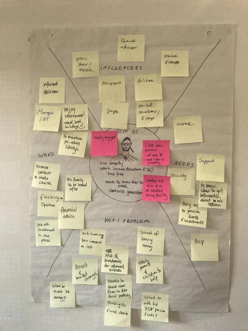
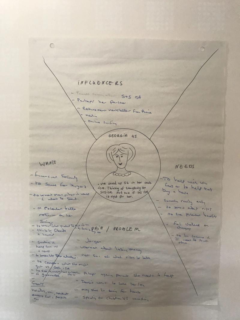
We needed to run several workshops on this project, simply due to the massive scope. What became most apparent from those sessions was that we needed to shift the focus to how the users approached retirement.
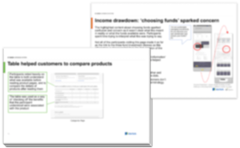
Then we continued the discovery phase with several techniques (the images below are blurred for NDA purposes)
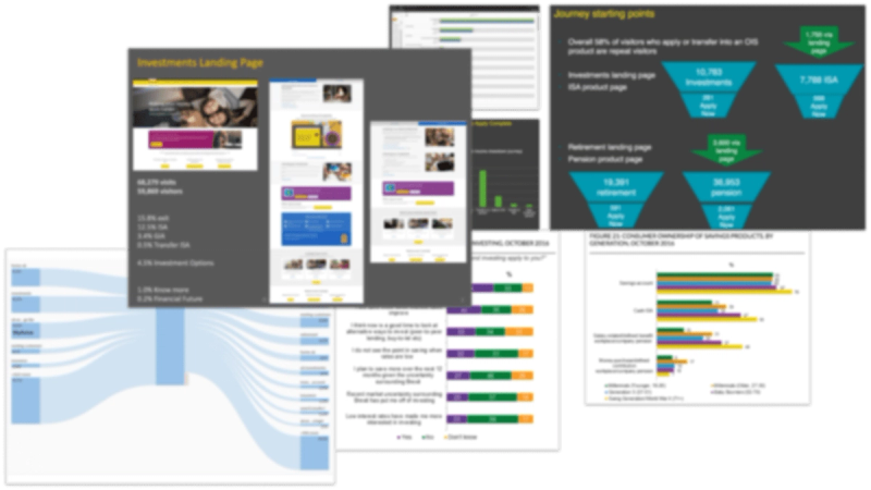
Finding solutions
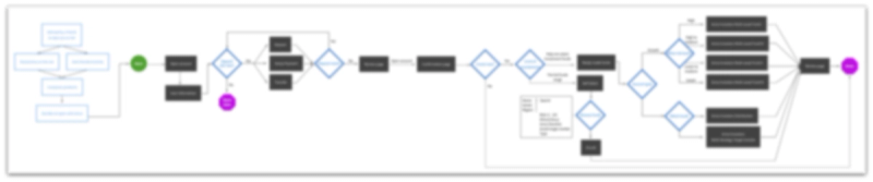
Then we started exploring solutions with drafts and wireframes
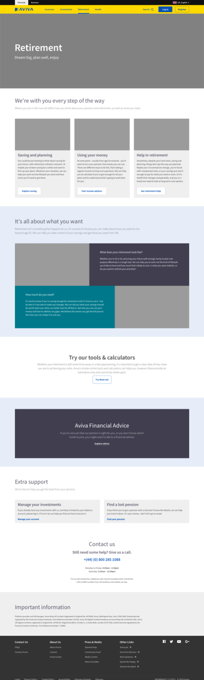
Eventually, we settled on considering how our clients deal with their pensions throughout their lives. After all, it’s something that’s a part of your life from when you start working (ideally) to after you leave it for your spouse or family.

Testing Assumptions
Our confidence in this assumption got verified when we went into the user testing labs. Participants understood the above as a timeline and found it easier to navigate.