
Creating a Design System
This design system project tackled the challenge of inconsistent user experiences and duplicate development work across 50+ siloed apps in Global’s Commercial Technology division. By bringing designers and developers together, we created a cohesive component library that ensured consistency across all applications. We also cut down on repeated efforts with shared resources, kicked off weekly “Design Talk” sessions to boost collaboration, and introduced better tools and processes like Figma. The project not only streamlined workflows and improved product quality but also leveled up the team’s overall design approach.

Lead Product Designer
Jul 2022- Aug 2024
The Challenge
When I joined Global’s Commercial Technology division as their Lead Product Designer, it was quickly apparent that the design team had been working separately in siloed apps. This lead to independent style choices, and inconsistent experiences. Though apps were kept separate in development, users still needed to use multiple ones to complete their tasks, which resulted in a broken experience. Moreover, developers were repeating their work across different teams to develop similar components.Before the implementation of the Design System, there was great disparity between the appsThis was a situation that was causing a lot of people issues, from designers and developers to users.

Goals & Objectives
What we needed was a library of ready-made resources that could be shared between design and development.
Research & Understanding
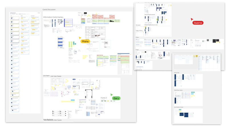
I started by setting up team sessions where for the first time all the department’s designers would work together and share their work with each other. In these sessions, we started looking at similar problems that we were solving in different ways across apps. From the about 50 apps the department developed and maintained, a lot of the same functionality was repeated, so we tried to combine the different designs we had into something better than any of us could have come up with on our own.I had started doing group sessions with my team once a week where we reviewed designs and helped each other which became known as the weekly “Design Talk”. These sessions became mostly dedicated to reviewing the existing components, along with examples on how they get used in different contexts, and distilling the best of each variation into a single design that satisfied everyone’s needs. We ended up using a different hour long session for Design Critique of each other’s work.
Running a Design Talk
Before we got to the Design Talk session, we would all be aware of what we would be working on, and looked over our designs for examples of the component we would be discussing. For instance, if we were discussing an input, we would look at wherever we were using them in our work, and collect those examples into a Miro board created for this purpose. When we started the meeting, we should have everything we need to have a productive discussion.In the session, we would each talk through our examples and how the component is being used at the moment, in the designs and in the reality of the app. The others could then ask questions around the component, behaviours, rules, user journey, and anything else necessary to fully understand it. Throughout these presentations and discussions we would write down the different aspects we need to consider and make decisions on. In this example it would be things like:
- What does placeholder text look like?
- How does it behave when the text doesn’t fit, does it truncate or wrap the text?
- Does it need a disabled state? When and how is it used?
- What does an error state look like?
Running a Design TalkThe role of the facilitator here is very important, as people might get too attached to their own designs and opinions, no matter how much experience one may have. The facilitator needs to keep the conversation focused on the components and use cases and stop it from becoming unproductive. Ive found using the supporting materials in Miro, and focusing on the users’ needs to be a good way to focus on the objective and prevent things becoming too subjective or personal. Writing down what the team agrees in post-it’s or text is a good way of setting small things in stone and anchoring everyone to the facts, even if it’s a question or a decision that needs to be made written down.As the team agrees on things, these should be written down as an anchor, but also as a note to write the summary, more on that later. These should answer the questions you had before, but isn’t limited to that. For instance:
- Placeholder text uses the style Body 1 and uses colour Neutral 400
- Long text should truncate, except if we are expecting long text (i.e. notes, comments, etc), in which case we use a text area component
- Value text (filled) uses style Body 1 semibold
In this example, the filled value’s style was agreed upon by the team, though it wasn’t posed as a question before. More importantly, not all questions have been answered. This is left as homework for next weeks session.If there is a decision the team feels like they don’t have enough information to go on, they shouldn’t be forced into making a decision within the time limit of the meeting. If the facilitator notices a lack of information, or that a discussion is taking too long and derailing the meeting, it can be decided that for next session members of the team will need to research and collect use cases from across existing designs, so that the decision can be made at the next Design Talk.
The Solution
Documenting your work
Once a decision has been agreed on, the very next thing to do is for the team lead or the facilitator to share a summary of it with the team. This should contain a thank you to the team and a (usually) bullet pointed list of what was discussed in the meeting, what decisions were made, and what was left as homework. This serves as a reminder to the team, as well as a register of all the decisions that were made.Once that’s done, the component needs to be documented in a more systematic way, so that it can be shared with the developers and anyone else who might need to read it. There are a lot of options for this stage, such as:
CMS (Confluence, Sharepoint, Figma, ZeroHeight)
Pros
- Present in most corporate environments
- Simple “what you see is what you get” (WYSIWYG) editor
Cons
- Often difficult to use
- Limited features
- Difficult to use navigation, making the documentation hard to find and navigate, often resulting in the documentation not getting read
- Requires manual upkeep
Figma
Pros
- Design team already familiar with it
- Updates propagate automatically
- Full control over look and feel
Cons
- People outside the design team aren’t that familiar with it
- Difficult to remember to use this tool just for design documentation
- Navigation wasn’t design for this so it’s not that friendly to stakeholders outside the design team
Developer tools (Docusaurus, Nextra)
Pros
- Can be its own site that people can bookmark
- Development and design documentation can coexist in the same place
- Navigation can be fully customised
Cons
- Often requires a little development knowledge as the pages tend to be written in
.mdxor similar, and might need to be pulled and pushed to a git repository - Requires manual upkeep
We tried all of these, but ended up adopting Nextra as our solution. This is the most accessible solution, and we could work closer with developers.Design System Documentation example using Nextra (buttons)
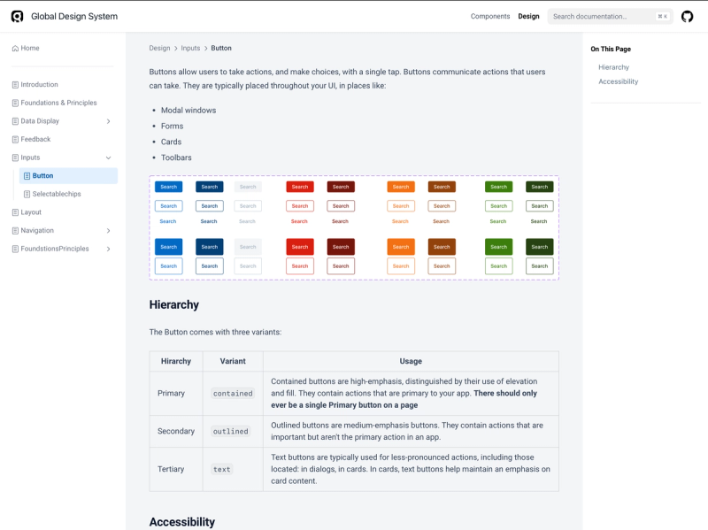
Initially we documented the information in Figma, and only moved it to Nextra once it was complete


Organising your work
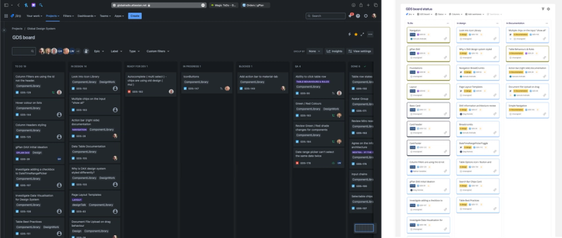
Every other Friday we setup a meeting with the developers to go over what they have done, what’s ready for them to pickup, or if any tickets need clarification.The design team then clarifies any questions, show what we have been working on, and may even show some things that are not ready for development. We do this using a Jira project that contains the tickets they will be working on, as well as the design tickets. The tickets move from “To Do” to “In Design” and “In Documentation” before being considered “Ready for Dev”. This means we can track the design work and the development work together, even if occasionally it needs to be adjusted, such as breaking something down into smaller tickets for development.
Because Jira isn’t a designer’s natural habitat, we sync those tickets to the Miro board where we have our weekly Design Talks, so we don’t need to move between apps, and we can organise our workload there.Jira Board where work is tracked for allMiro synced with Jira showing only tickets relevant for Design Talks so we don’t need to move between apps, and we can organise our workload there.
Impact and Learnings
This project successfully established a unified design system for Global's Commercial Technology division. By implementing Design Talks and a centralised design library documented in Nextra, we achieved:
- Increased design consistency across all applications.
- Reduced development time through component reusability.
- Improved communication and collaboration between designers and developers.
Throughout this process, I learned the importance of fostering a collaborative design environment. Design Talks provided a platform for designers to share their knowledge and expertise, leading to a more robust design system. Additionally, choosing the right documentation tool (Nextra) ensured accessibility for both designers and developers.

This project serves as a valuable example of how a lead product designer can establish a design system to improve efficiency and create a more unified user experience.
Improving existing design processes and helping the department grow in design maturity. This role was focused on data heavy application to support complex business processes. I grew the team and implemented new processes to ensure the quality and consistency of the products we worked on. I also mentored and coached my team members, as well as other stakeholders (mainly PMs) on design strategy and best practices.
- Create an efficient and knowledgeable team
- Introduced new processes and tools, including better user research and modern tools like Figma
- Instilled a culture of design as part of product strategy Proved the value of research and made it a standard part of developing any product
- Consolidated disparate visual languages into a cohesive component library and managed its design and implementation