
Nova: Healthcare Design System
Nova is a scalable design system built from scratch to unify the UX across six complex B2B healthcare compliance products. It introduced a shared design language, 140+ documented components, and a token-based architecture that bridged design and engineering — enabling a 12-person client design team to work faster, more consistently, and independently after the engagement ended.

Lead Product Designer
Feb 2025- Jan 2026
The Challenge
Through rapid growth and acquisition, RLDatix's product ecosystem had become fragmented. Multiple products had grown independently, each with its own visual language, interaction patterns, and component library. This created:
- Inconsistent UI and behaviour across products, increasing cognitive load for hospital staff
- Redundant design and development effort across teams
- Slow delivery cycles due to the absence of a shared foundation
- High onboarding cost for new users across the product suite
The challenge was not simply to build a component library. It was an organisational design problem: how do you get multiple products, multiple teams, and multiple stakeholders aligned around one shared foundation, and make sure it outlasts the engagement?
My Role
I led Nova end-to-end as sole design system lead, embedded within a 3-person YLD team contracted by RLDatix. My responsibilities included:
- Defining the vision, architecture, and strategic roadmap for the system
- Running cross-product audits and facilitating component workshops with the 12-person client design team
- Designing and documenting 140+ components and all their variants across tokens, foundations, and UI patterns
- Driving the Figma → Storybook → Chromatic pipeline in collaboration with developers
- Upskilling the client design team to own and evolve the system independently after handover
Research & Discovery
We started with a cross-product audit — collecting every recurring UI pattern across all products to surface shared needs, inconsistencies, and gaps. Evidence before architecture.
Each designer owned products they knew deeply, so we ran structured workshops where the team aggregated real use cases before any component was designed. This grounded Nova in actual interface needs rather than theoretical ideals.
From the audit we identified the highest-impact components to tackle first - navigation, buttons, and form inputs - which, once standardised, would immediately unify the experience across all six products.
Strategy & Prioritisation
Tokens first. Then components. This was the most important strategic decision.
Tokens — covering colour, typography, and spacing — are the contract between design and engineering. Building components without them means every design decision is hard-coded, and every change cascades into manual rework across the entire system. Getting the token layer right made consistency structural, not aspirational.
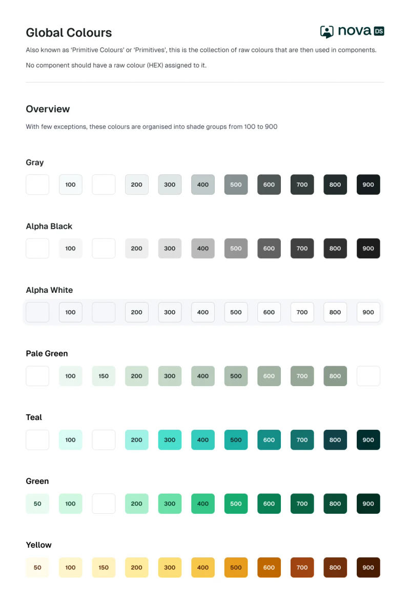
We used a two-tier token architecture:
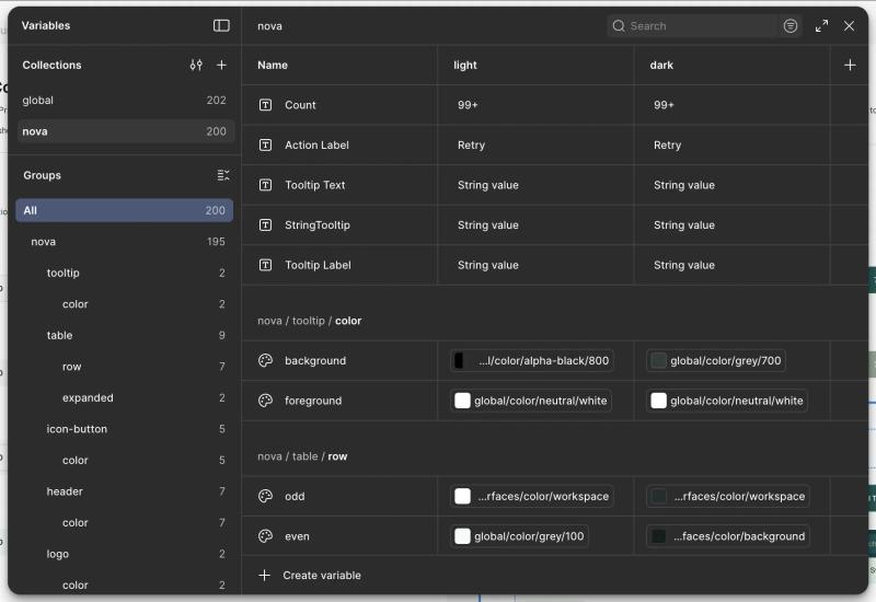
- Primitive tokens — raw values (e.g. dark-blue-700, #1F4CB3)
- Semantic tokens — functional aliases (e.g. color-button-primary-default) that reference primitives and are shared with developers as CSS custom properties
This meant designers and engineers worked from the same variables, reducing ambiguity, accelerating handoff, and making the system AI-ready for tools like Figma Make.
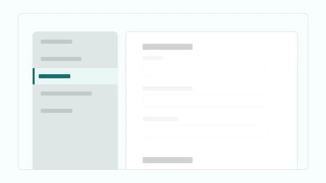
Once foundations were stable, we prioritised components by ubiquity and structural impact. Navigation came first: aligning on it immediately unified the information architecture across all six products, making every subsequent component decision faster.
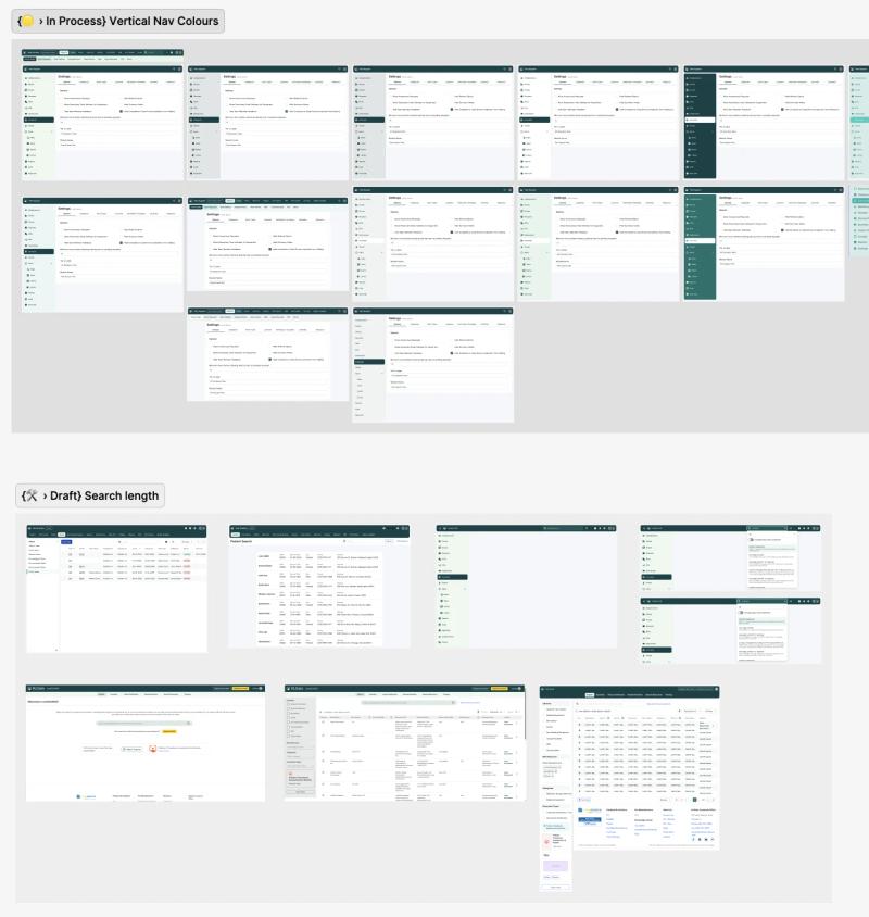
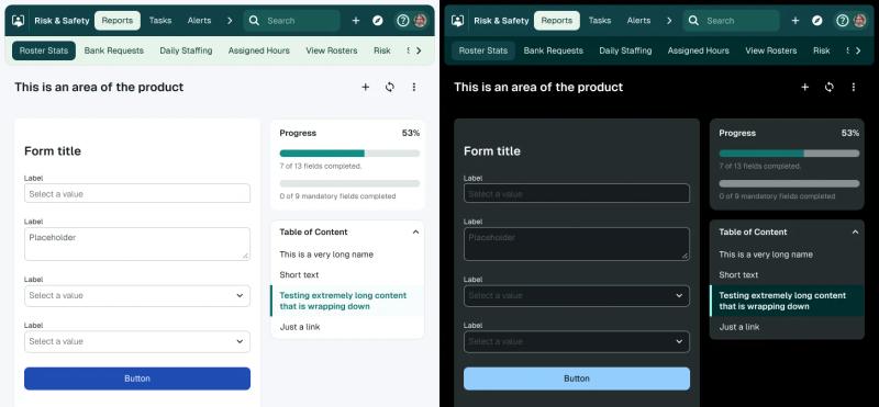
Nova was then stress-tested by being applied to 6 of the products.
Team Organisation
With three designers working across six products simultaneously, we needed a clear system for organising work and tracking progress.
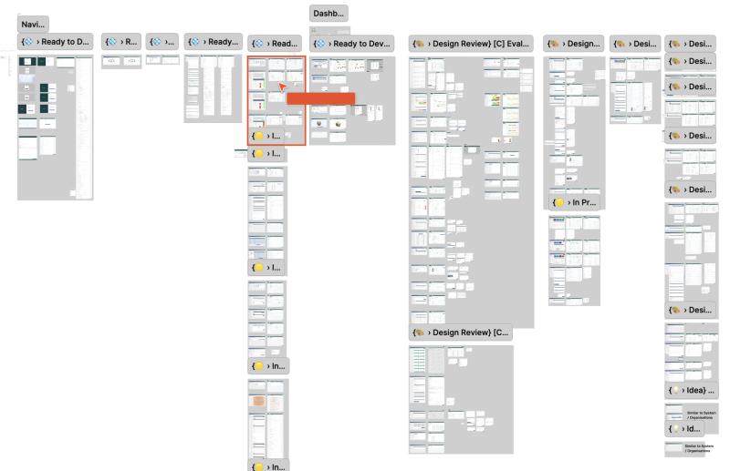
Cross-product components
Whenever a new component need was identified, all use cases across all products were aggregated into a dedicated page in the Figma file before any design decisions were made. The whole team reviewed and agreed before anything was added to Nova.
Single-product work
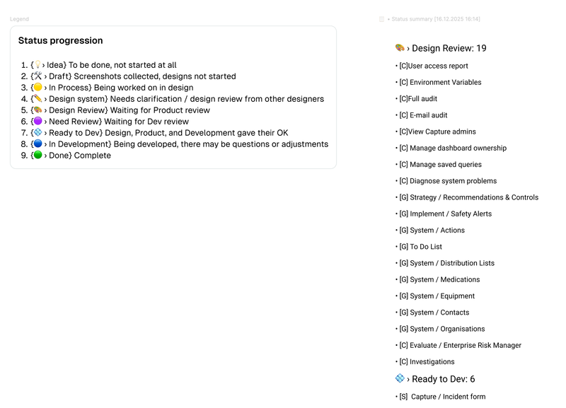
When multiple designers worked on the same product, sections were used to divide the work. Each section carried a status tag and designer initial using the StatusUp Figma plugin, enabling live progress reporting back to stakeholders at any point.
Weekly cadence
A dedicated Design System session ran every week, separate from product work, to review components, resolve conflicts, and keep Nova moving forward.
Accessibility & Design Principles
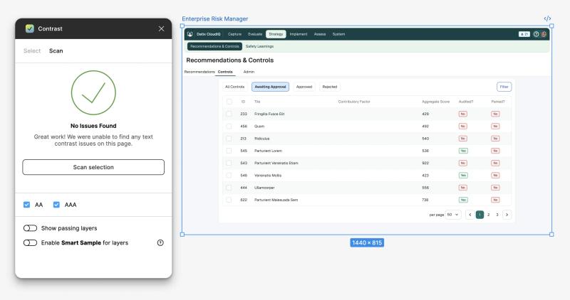
Accessibility was a foundational requirement, not a retrofit. All tokens, components, and interaction patterns were designed to meet WCAG 2.1 AA compliance, a non-negotiable in healthcare environments where users include clinicians under pressure, people with visual impairments, and keyboard-only operators.
Beyond colour contrast, this included:
- Colour-blind accessible sequences — status colours were never used as the sole differentiator; patterns and labels were added
- Tooltips on all icon buttons — supporting both sighted users and screen readers
- Tab order built into components — so every product could be navigated by keyboard alone
- One primary action per page — an interaction rule that reduced cognitive load and eliminated ambiguity in high-stakes workflows
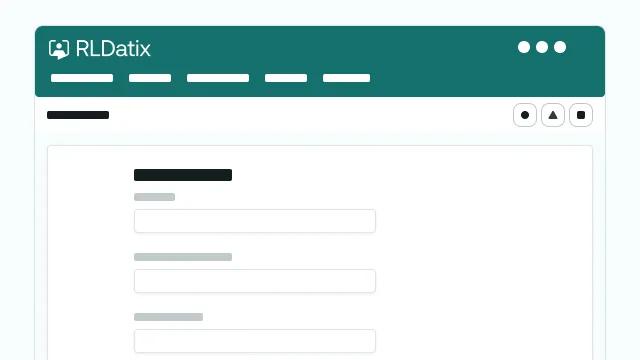
Component Architecture & Variables
Nova's components inherit from tokens, making consistency automatic. The architecture followed atomic design principles — complex components composed from smaller, tested parts — which guaranteed consistency down to the smallest element.
Key architectural decisions:
- Flexible variants, not bloat — components had clearly defined variants for states (hover, focus, pressed, disabled, loading) and contexts (default, compact, mobile). Pressure to add unnecessary variants was actively resisted; a component with 12 variants is harder to maintain than 3 well-defined ones.
- Custom components contained — product-specific patterns that didn't meet the two-product threshold were housed in a separate Custom Components page rather than polluting the shared library. If adopted by a second product, they were promoted into Nova.
- Figma Slots — used to allow content to be placed inside modal and menu components without breaking them, enabling tighter control of internal spacing and padding.
- Staged documentation — components were documented in Figma first, then imported into Storybook once developed. This kept documentation internally consistent while covering components not yet in code.
Design-to-Dev Pipeline
Every component followed a structured lifecycle from need to production:
Jira (ticket with user needs) → Figma (design, variants, states) → Code (developer implementation) → Chromatic (visual QA before merge) → Storybook (documentation, published to main) → Live (available in design and code)
Engineers were part of the system from the start — not handed specs at the end. Chromatic caught visual regressions automatically. Design and dev stayed in sync throughout, eliminating the ambiguity that causes late-stage rework.
Alignment & Adoption
A design system is not a Figma file. The real work was making it stick across three audiences simultaneously:
- Engineering — Storybook and Chromatic as shared source of truth, with developers embedded in the component lifecycle from ticket to production
- Client design team — brought into the process from day one, running workshops and owning component decisions, so they built confidence to continue independently
- Stakeholders — value made visible by applying Nova to live products, with before/after comparisons shown to product owners
The last months of the engagement were spent applying Nova across all six products — which also served as real-world QA, surfacing edge cases and validating that components held up under production conditions. The more Nova was applied, the more stable it became.
The clearest measure of adoption success: the contract ended, and the system didn't. The client team had full ownership, Nova was live across all six products, and they had the capability to keep evolving it independently.
Impact
- 140+ components built and documented
- 6 complex B2B products unified under one design language
- 12 client designers upskilled to full system ownership
- 0→1 system maturity — from nothing to self-sustaining, entirely from scratch
- Eliminated design-to-dev ambiguity — the Figma + Storybook + Chromatic pipeline replaced ad-hoc handoffs with a repeatable, auditable process
- Usability improved as a by-product — standardising components surfaced and resolved UX issues that had existed silently across products for years
Key Learnings
- Tokens before components — every hour spent on the token layer saved multiples in component rework downstream
- Adoption is an organisational problem — the system succeeds when the people using it helped build it
- Stability comes from application — Nova only became truly stable once applied to real products under real conditions; edge cases found in production are the best QA
- Documentation is part of done — components shipped without documentation aren't done; they're a future support burden