
Sofa Shopping
The Glow app redesign for EDF Energy was all about making energy usage more transparent and manageable for customers. By focusing on user research and real-world feedback, we created a sleek, intuitive interface that empowered users to track their energy consumption, set goals, and reduce their carbon footprint. The redesign not only enhanced the app’s usability but also aligned with EDF’s mission to drive sustainable energy practices, making energy management easier and more engaging for everyday users.

Senior UX Designer
Jan 2019- Mar 2019
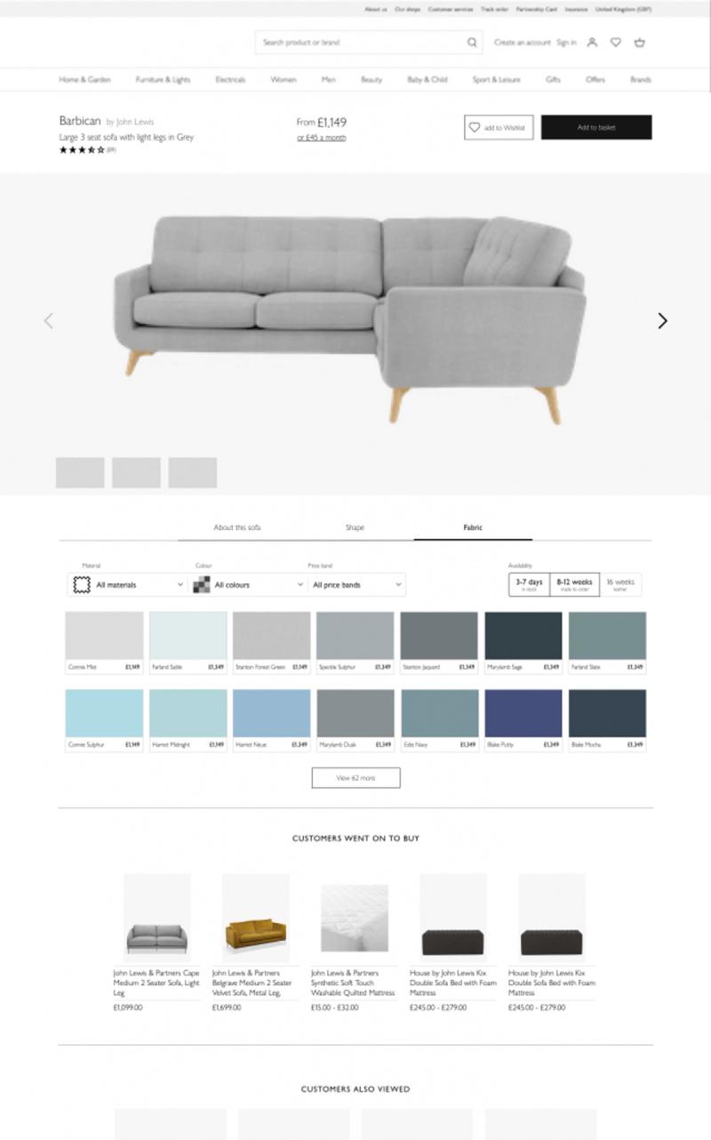
Redesigning how people shop for sofas
Sofa shopping is an important event in anyone’s life, as it’s a large purchase. People take a long time and do plenty of research before making an expensive purchase decision anywhere, including when buying sofas.
The current online journey is generic to all products and doesn’t cater to the specific needs of someone looking for the perfect sofa.

I was brought on board to take over the UX of the beta app they had built. This was an isolated, sandboxed micro-site only for upholstery where new ideas could be tested while keeping the regular experience up and running.
This meant we could take bigger risks and explore wilder ideas than the other teams
What I did
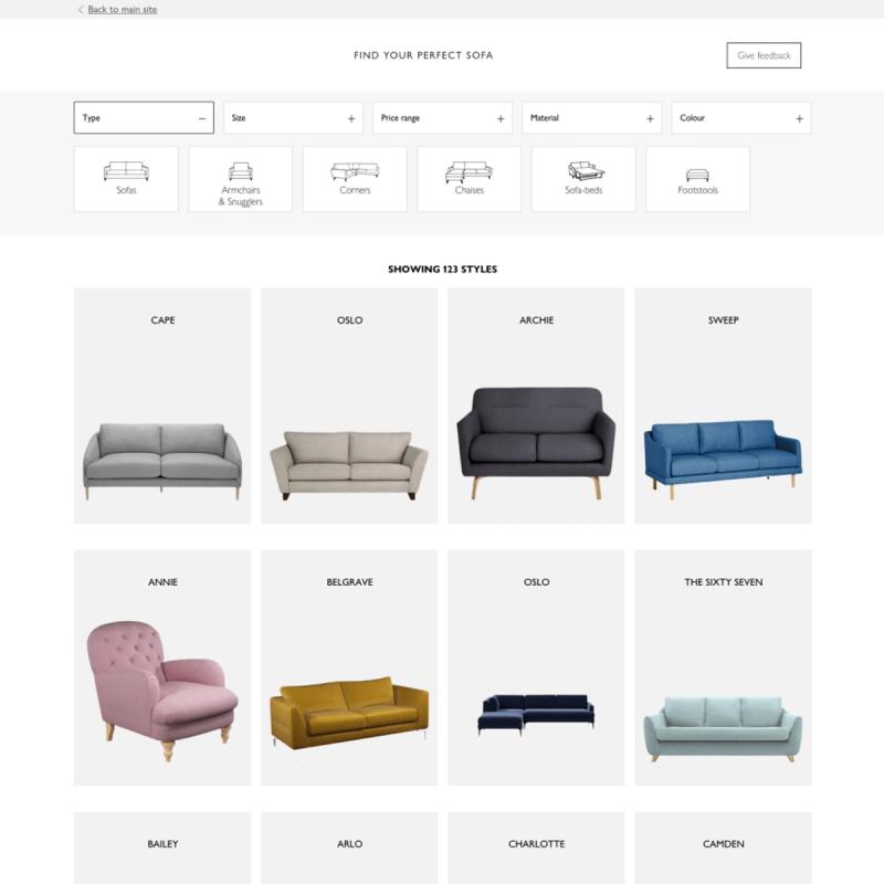
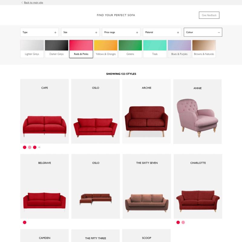
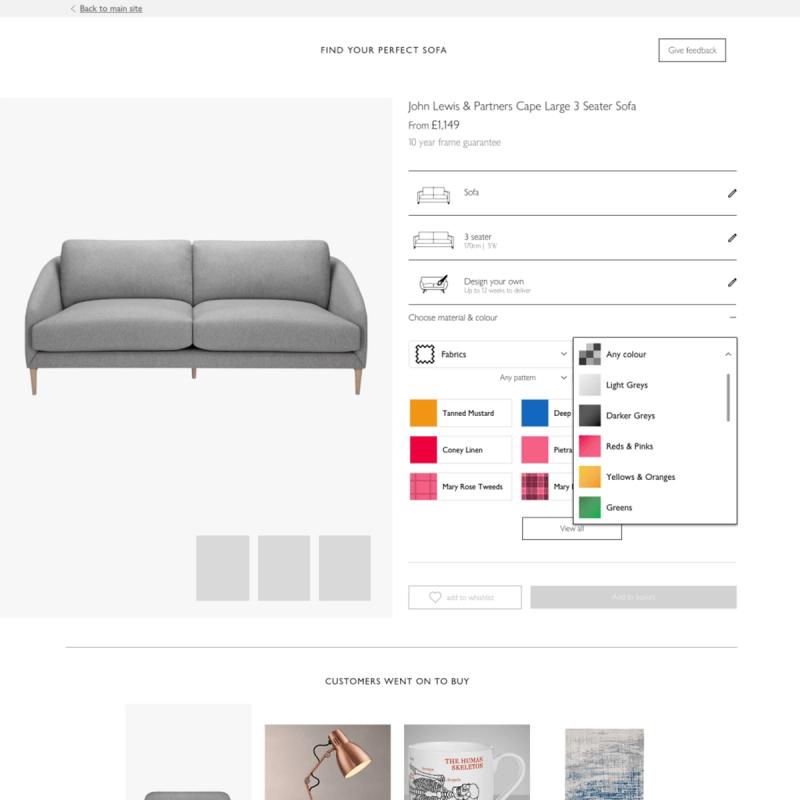
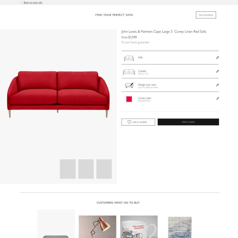
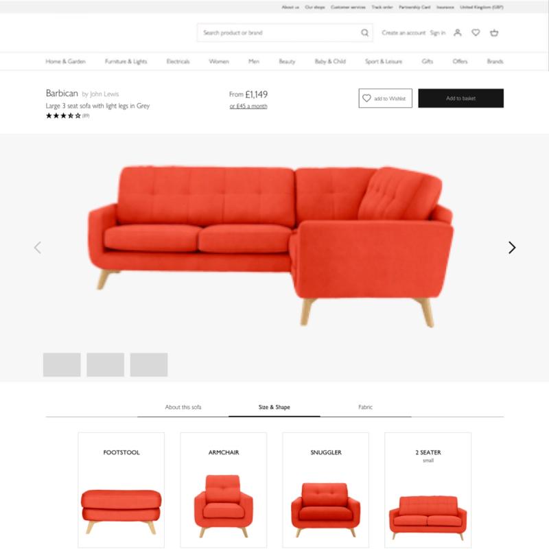
I helped the team to redesign the user journey for upholstery, including sofas, armchairs, footstools and such. This came after analysing the results they’d gotten from lab testing. The most significant finding was that the current journey was confusing to the users.

The users were expected to use the filters on a page which displayed the available ranges of products we had. This was an artificial grouping which had already proved successful with customers.
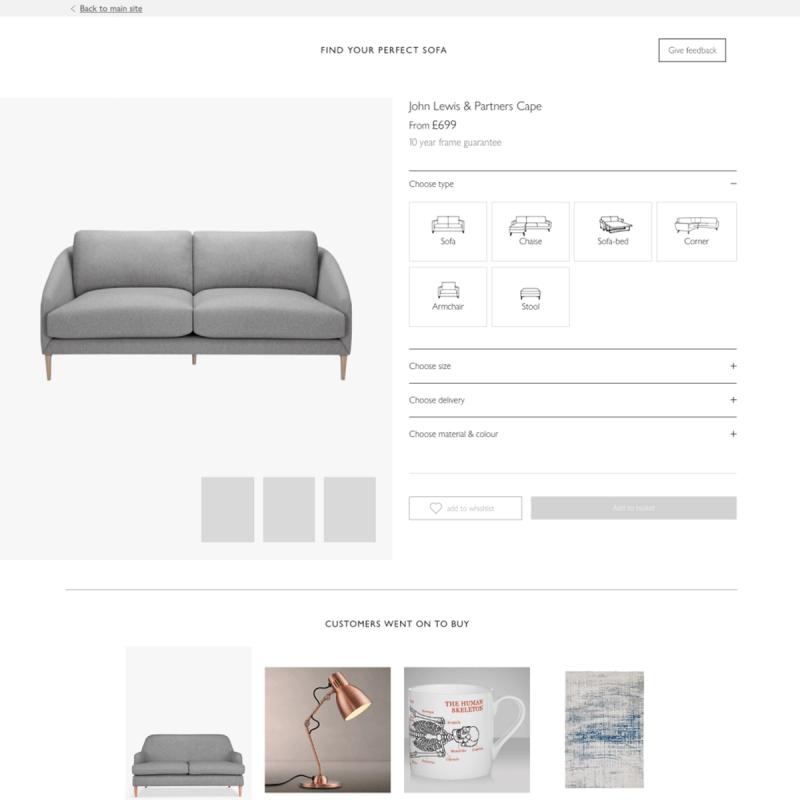
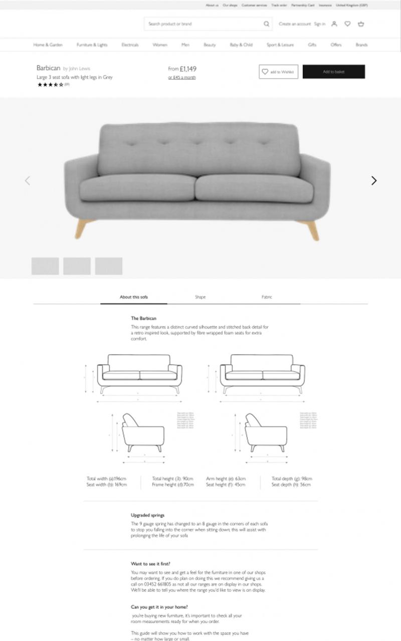
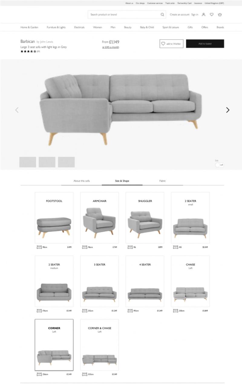
In the database, however, each different configuration of the sofa is treated as a different product. For instance, the same sofa with 2 or 3 seats is shown as 2 different products.
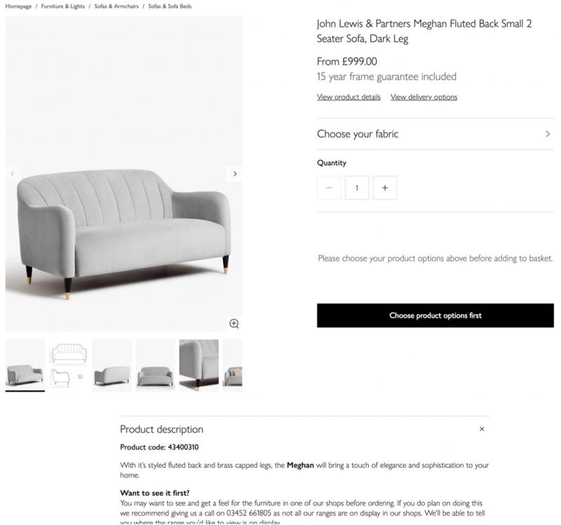
The next step in the journey is to take the user to a listing page of all these products. Upon selecting a specific product, then the user is finally taken to the product page where they can see the information about the product and proceed to purchase
By watching the participants through testing and analysing the testing data, it became apparent there was a disconnect between the internal business logic which had been driving the pages so far and our customer’s mental models.
Hypothesis
In the customers’ minds, they didn’t seem to be looking at ranges, but rather at product styles. That would explain their confusion at seeing the products listed for what was, to them, the second time.

So, to test this assumption, a prototype was put together to quickly validate this assumption which, if correct, would result in quite a dramatic shift for the team.
The test results we got back were encouraging, so we knew we had hit the nail on the head and should proceed with the new sofa shopping journey.
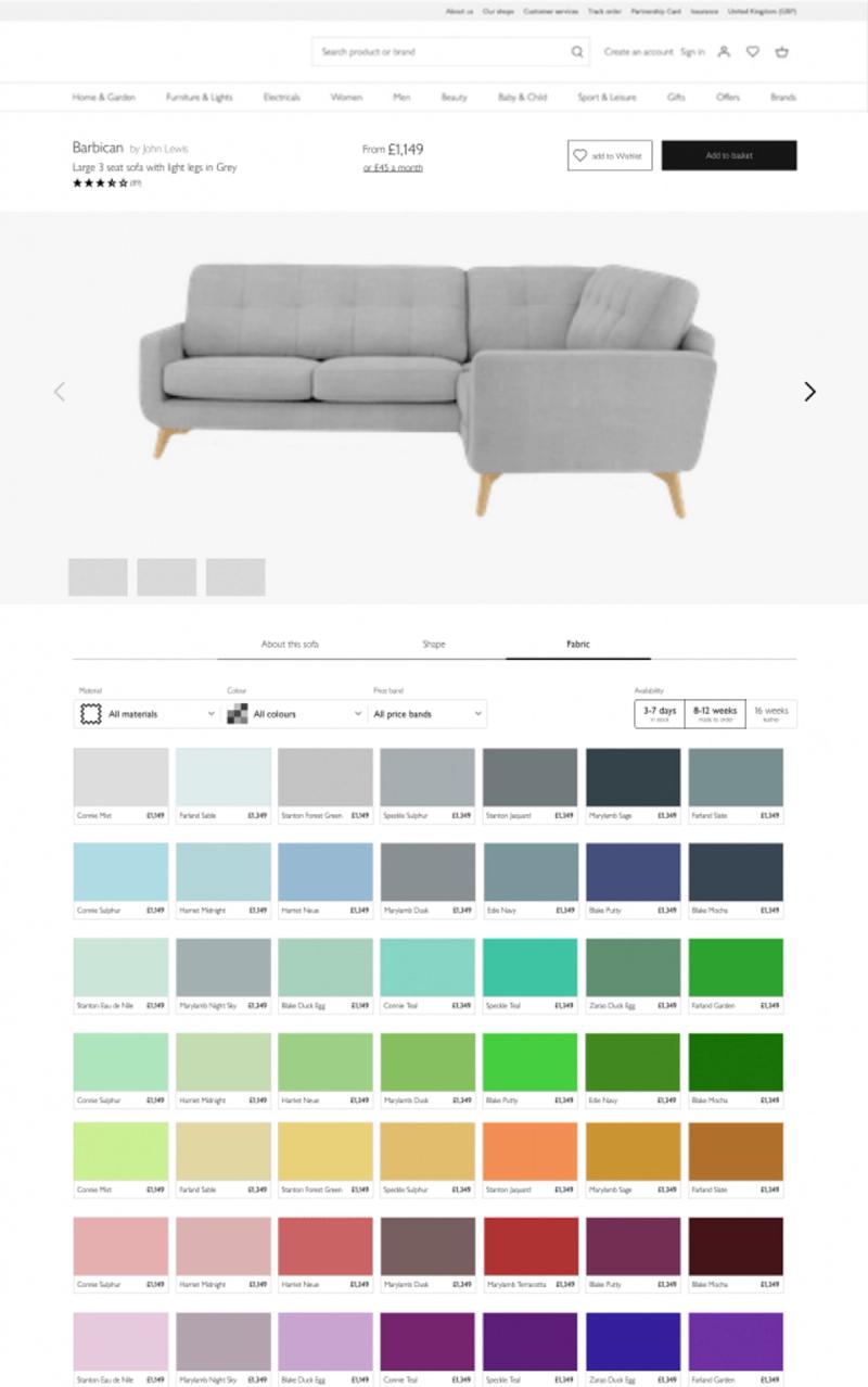
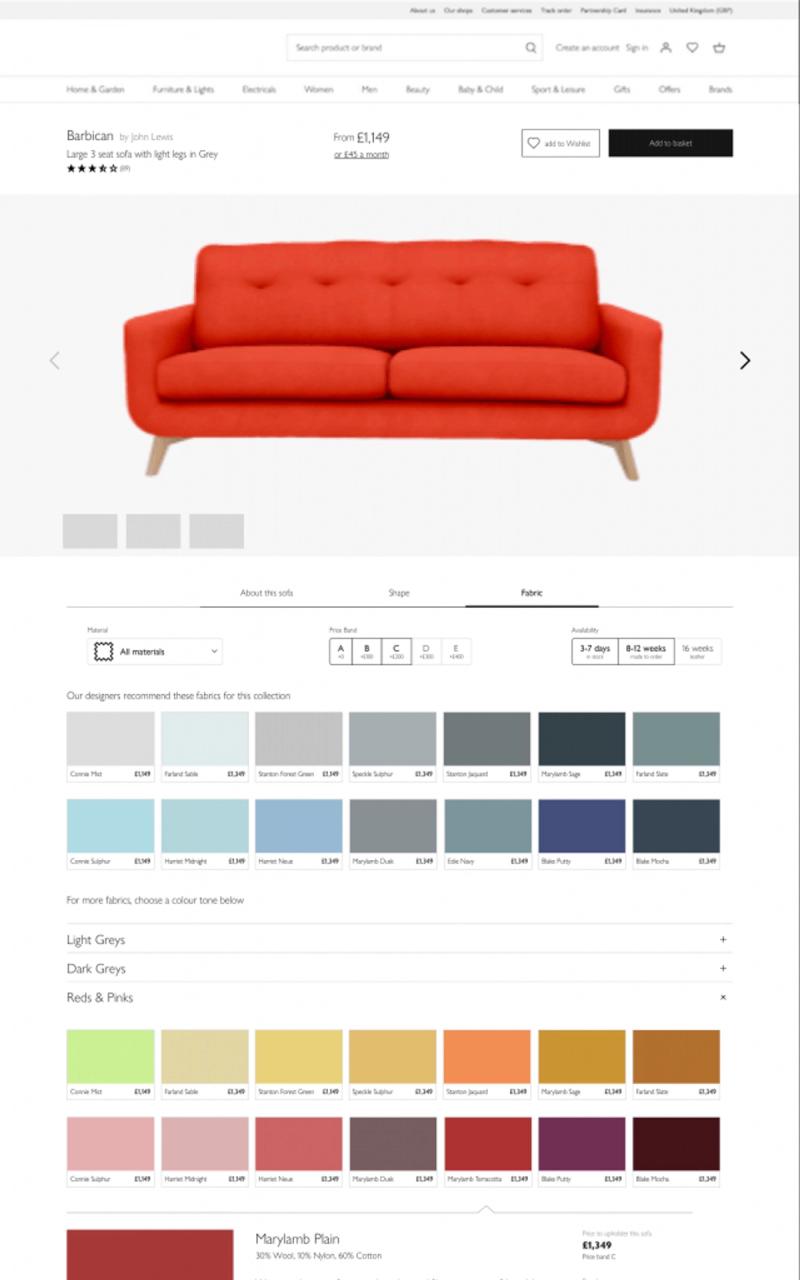
There were some issues participants had with configuring the product, so we tested another version of the product page, this one simplified even further and with more space for each of the configurations, so we can make our users (mostly middle-aged and older) as comfortable as we can.
Design System and Integration
Because this was so massively different from anything else on the website, I liaised with the other key teams involved most directly with redesigning the product pages.
Each type of product has different needs and quirks around what they need from a user journey, so we got together often to share our findings and steer towards a common goal. Naturally, each of us was free to experiment in their own way, but it was very useful to keep aware of what the others were doing.